Project Overview
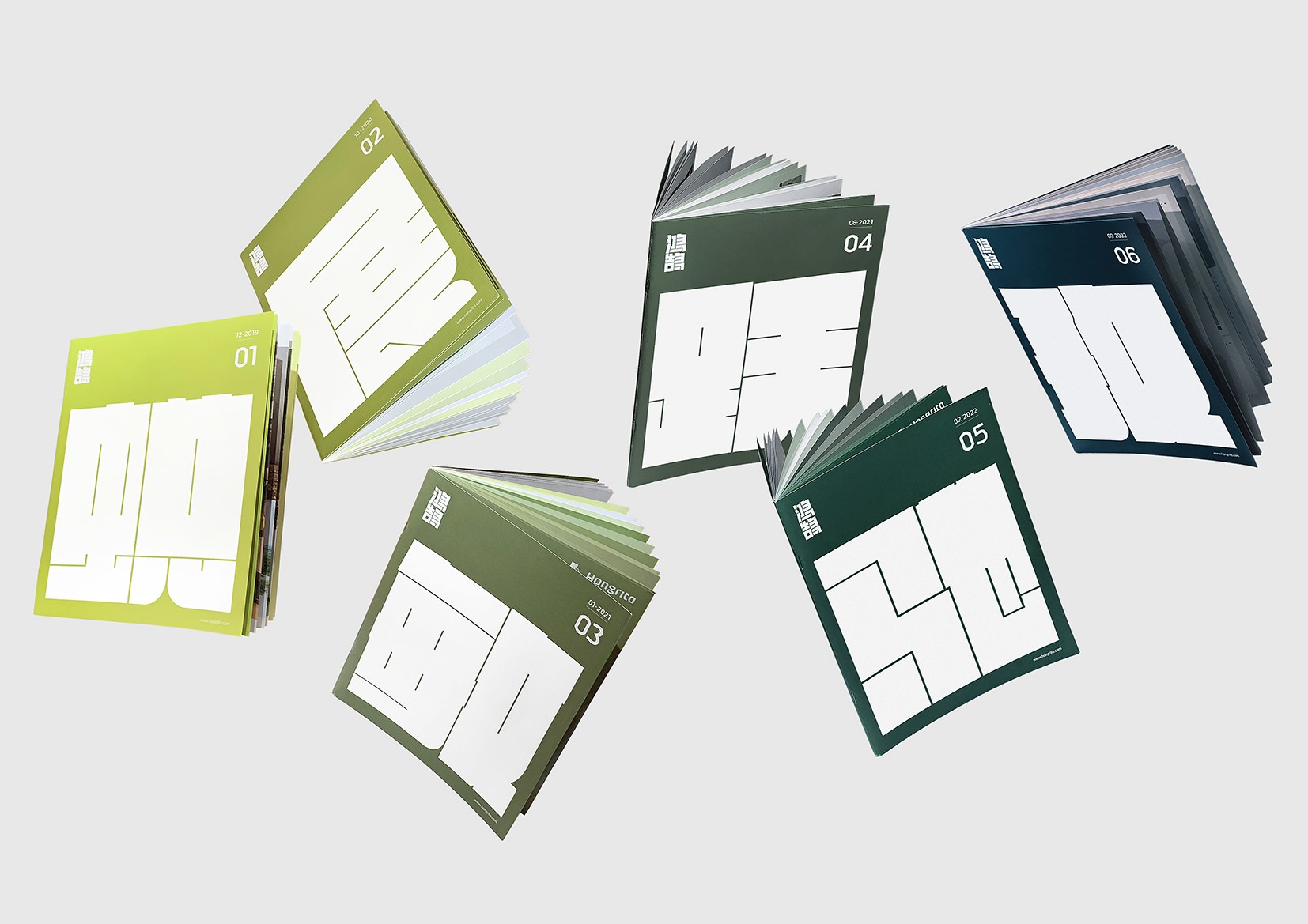
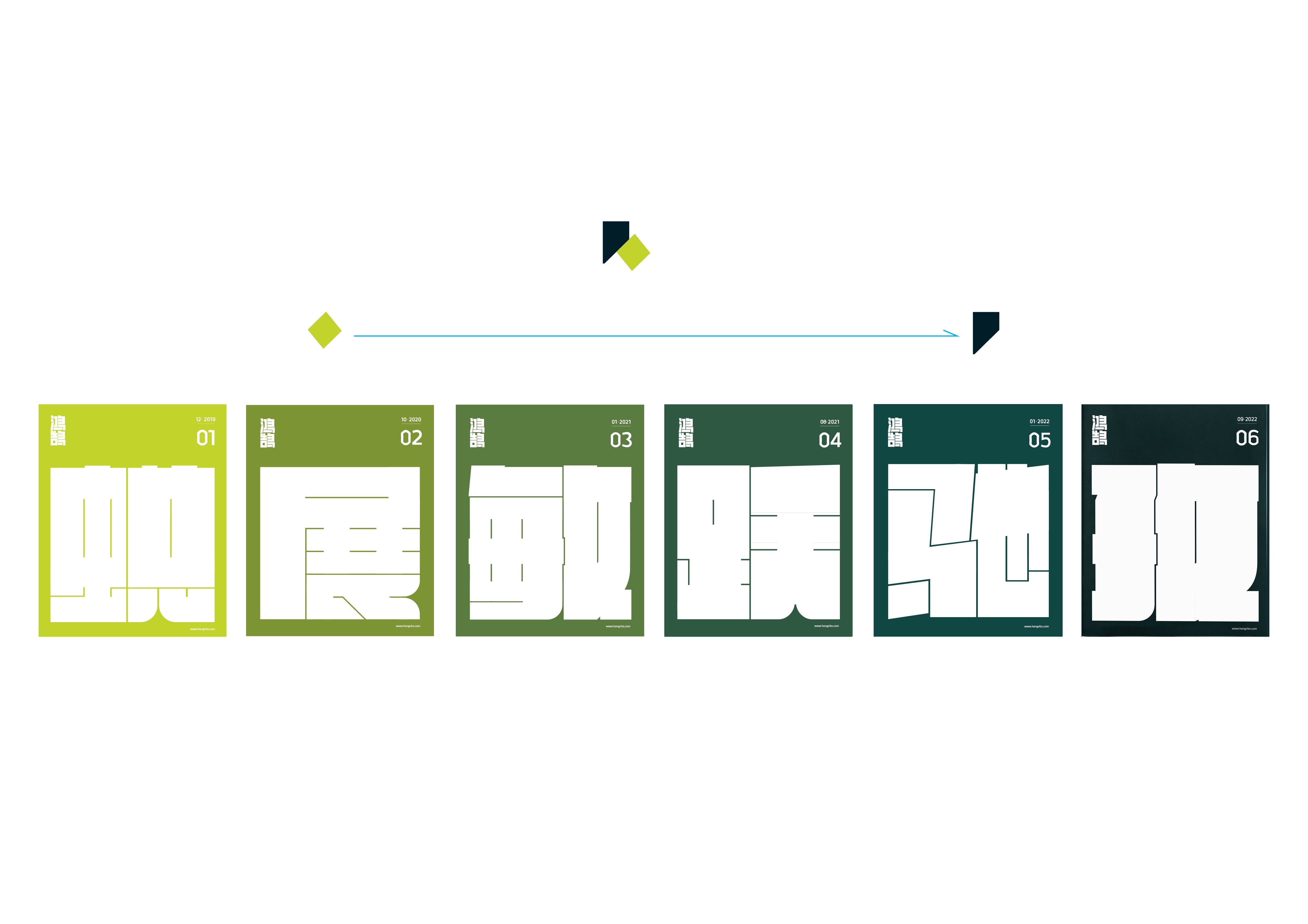
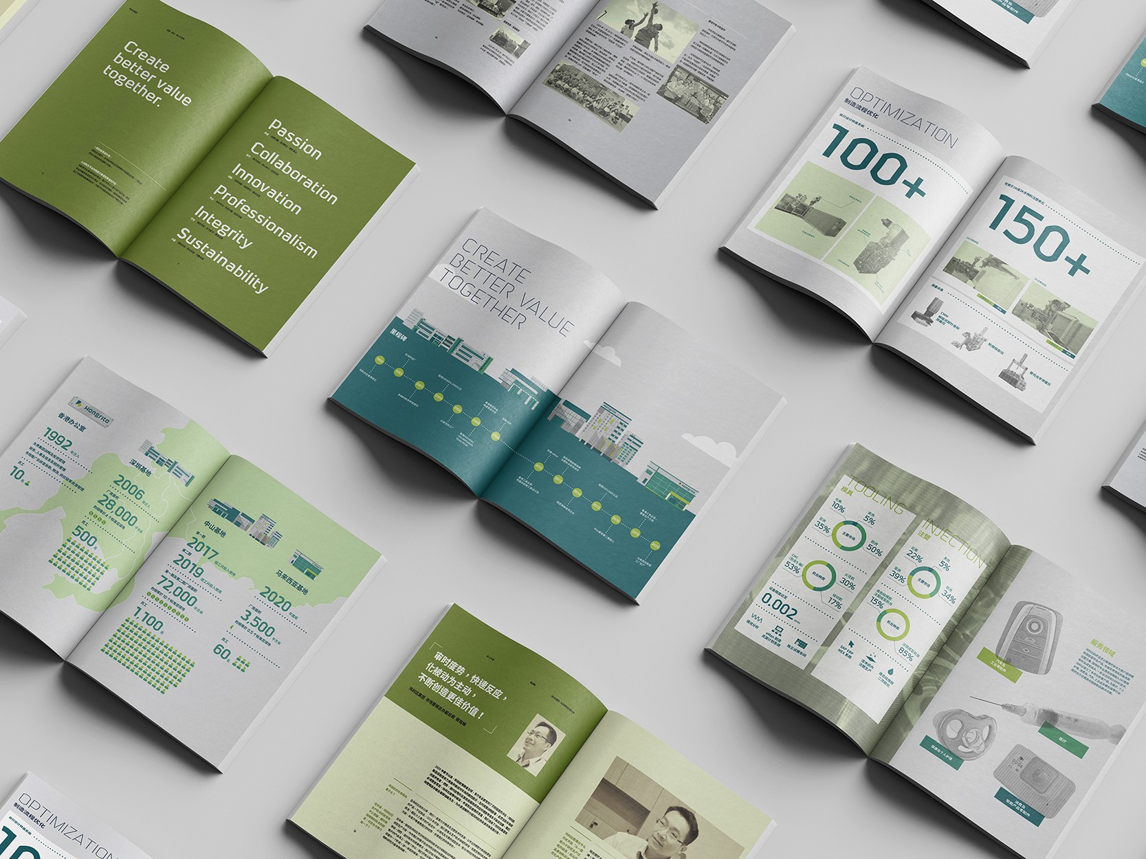
A quarterly published newsletter designed for Hongrita. For each issue, we created a unique concept by inviting the team to share a single word that encapsulates their experience over the past three months. This word served as the theme and inspiration for the newsletter's cover design, ensuring that each edition felt personal and reflective of the team's journey.
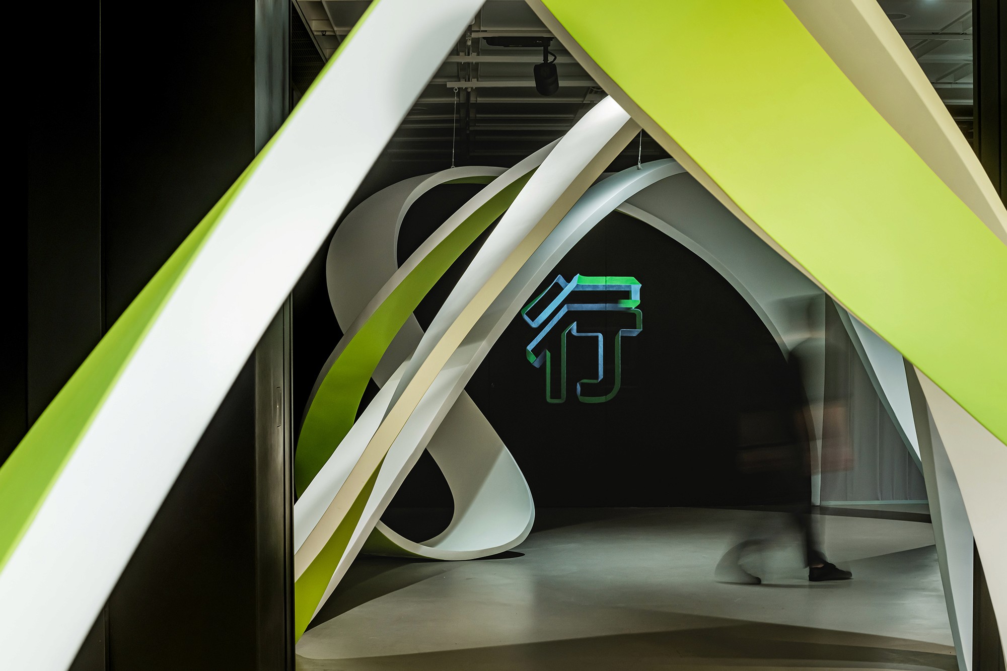
The design direction emphasized the brand's signature colors, light green and dark green. As the year progresses, the shades of green subtly transition from lighter to darker hues in each issue. This visual transformation symbolizes the company's ongoing growth and forward momentum.
