"In-Between 行行重行行" Exhibition

"In-Between 行行重行行" explores the transformative journeys of artists, highlighting lesser-known works that reveal their evolution.
Company

Hong Kong Museum of Art

Role

Graphic Designer Curator

Tools

Illustrator Photoshop After Effects

Skills

Curatorial Collaboration Artist Engagement Visual Identity and Branding Creative Direction

Project Overview


The In-Between 行行重行行 exhibition draws inspiration from a Han Dynasty poem - 《行行重行行》, symbolizing the challenging journey artists undergo as they evolve in their craft.

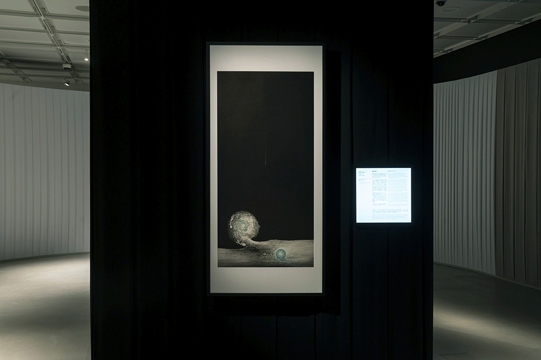
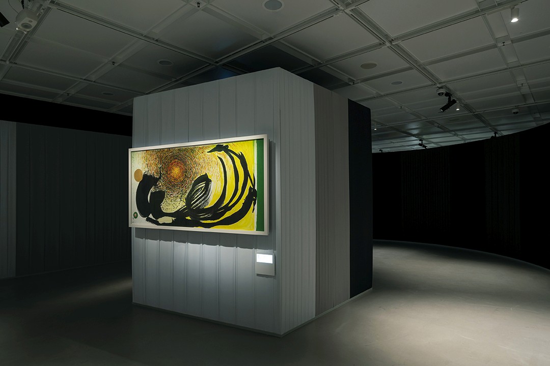
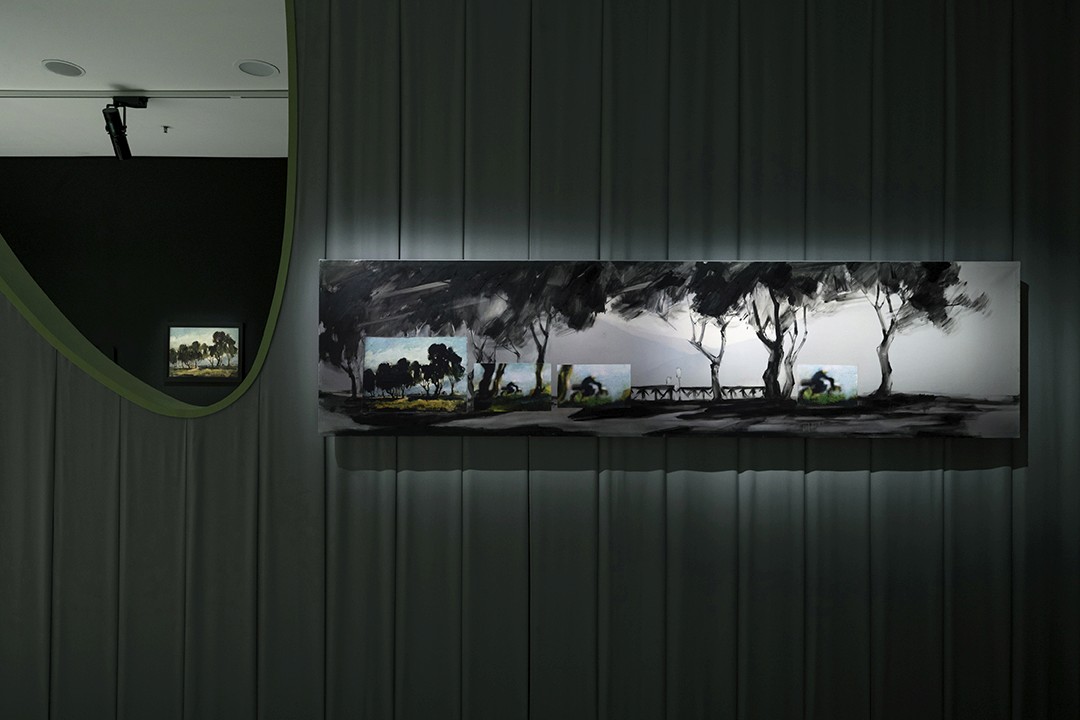
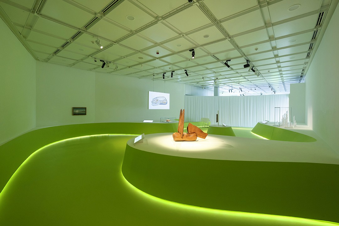
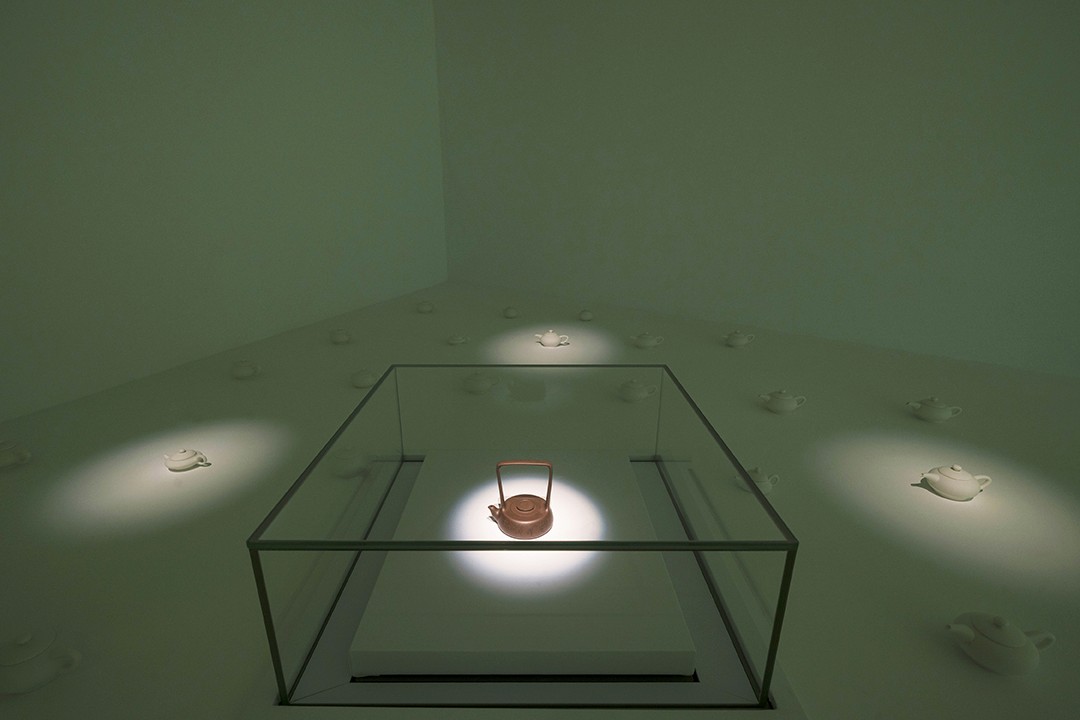
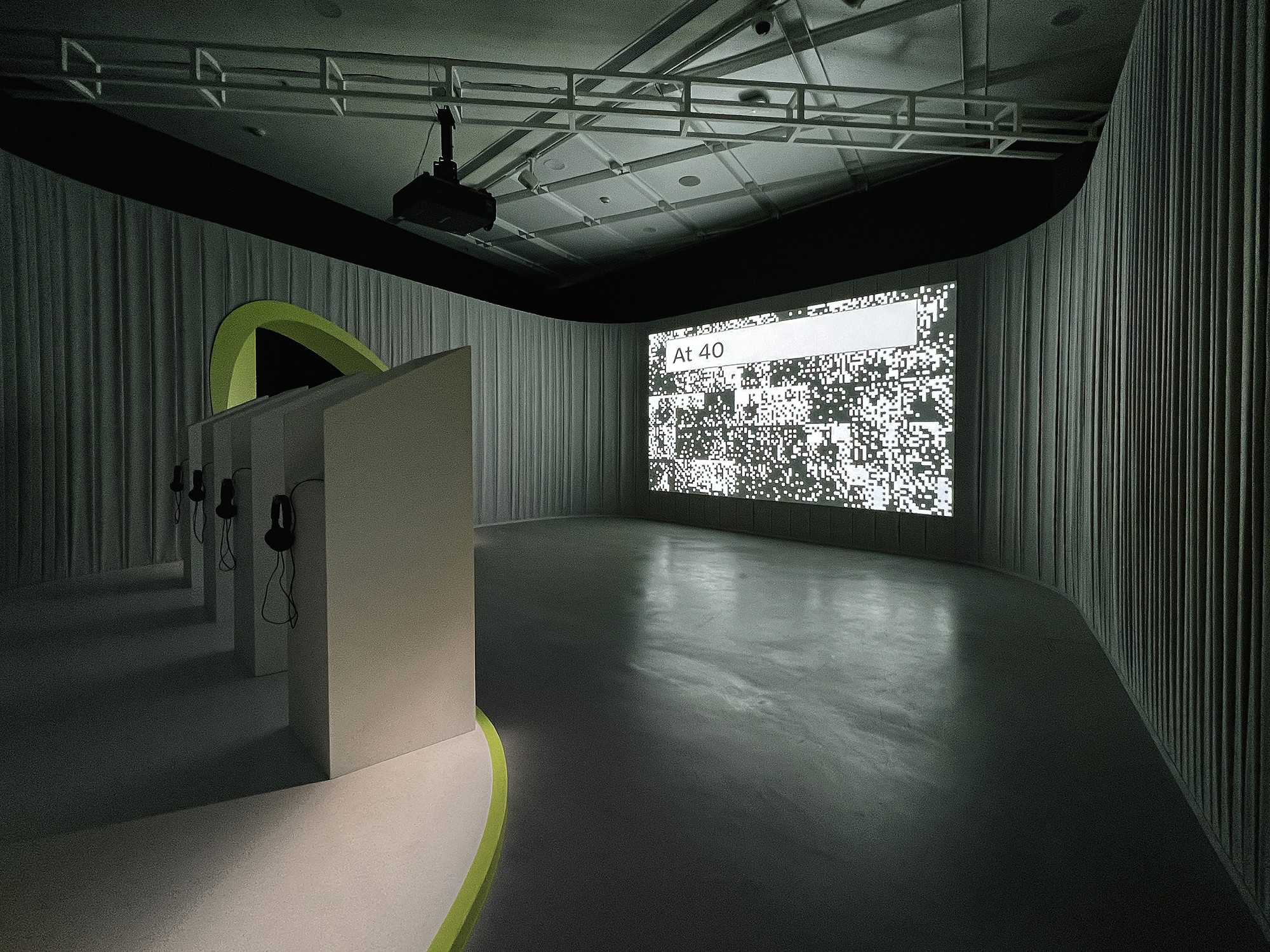
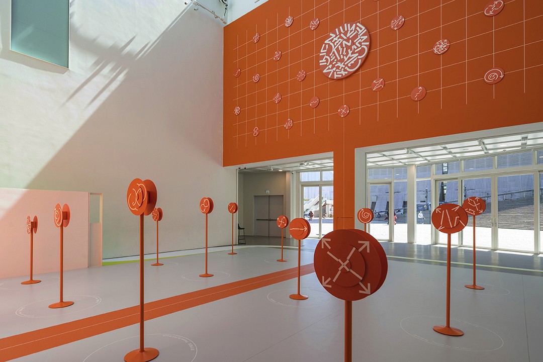
The exhibition highlights lesser-known works by prominent artists from HKMoA’s core collections, celebrating the transformative moments in an artist's creative career. Additionally, the exhibition features local artists who explore the theme of ‘Art as Practice,’ reflecting on life’s in-between moments through various art media. The curated selection emphasizes the journey of artistic growth and the hidden stories behind each piece.

Collaborating closely with the curatorial team, I contributed in shaping the exhibition's direction, selecting the right collections, and engaging local artists. My contributions extended to the design, branding, and visual identity, bringing the exhibition's theme to life.
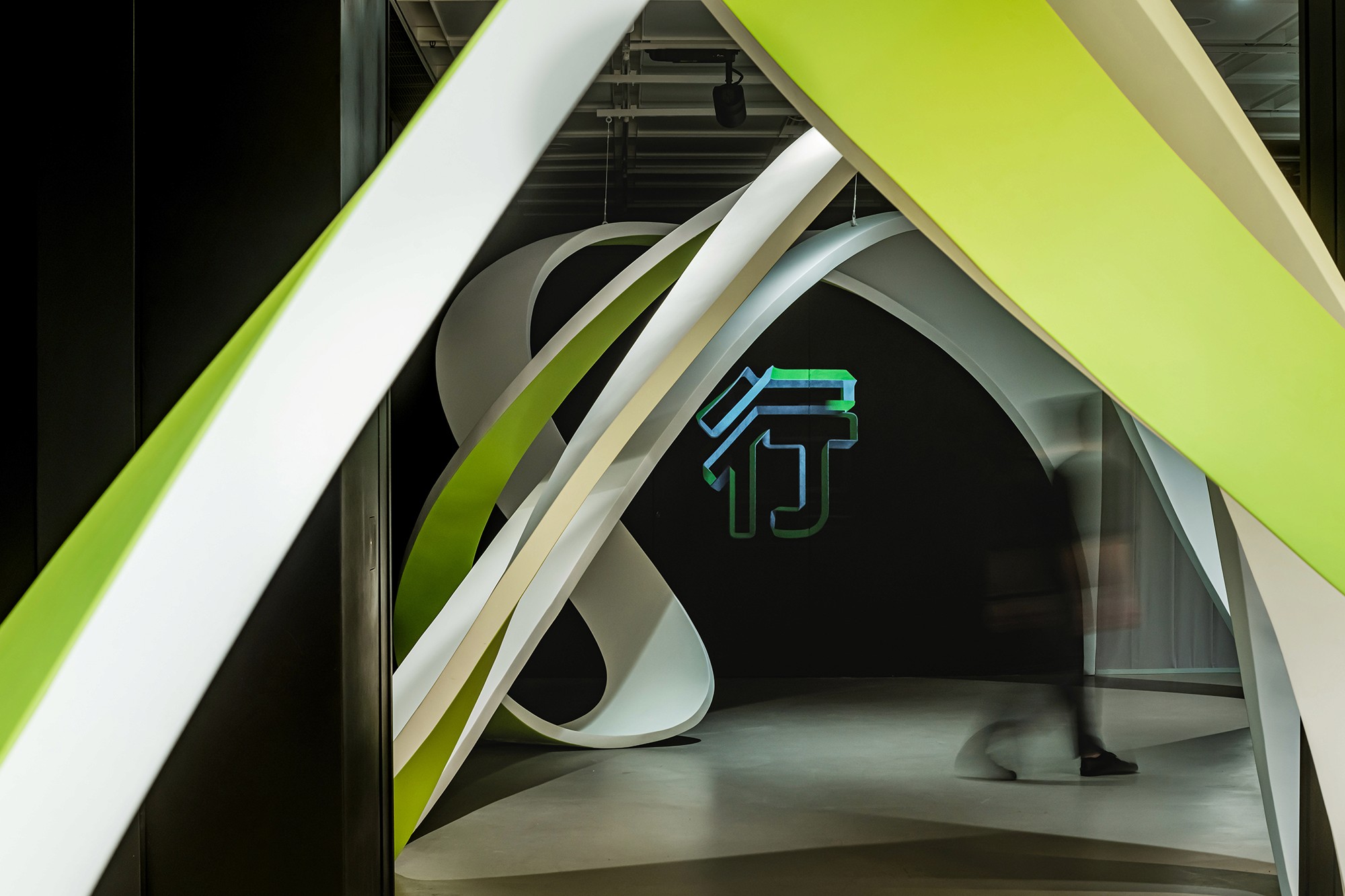
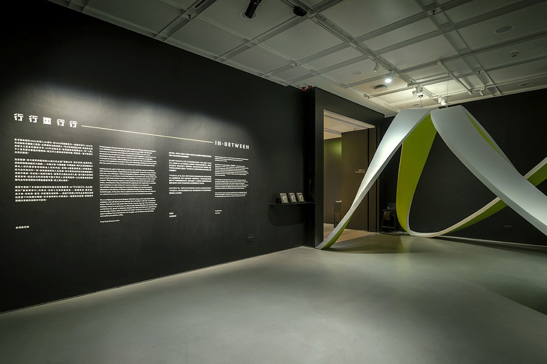
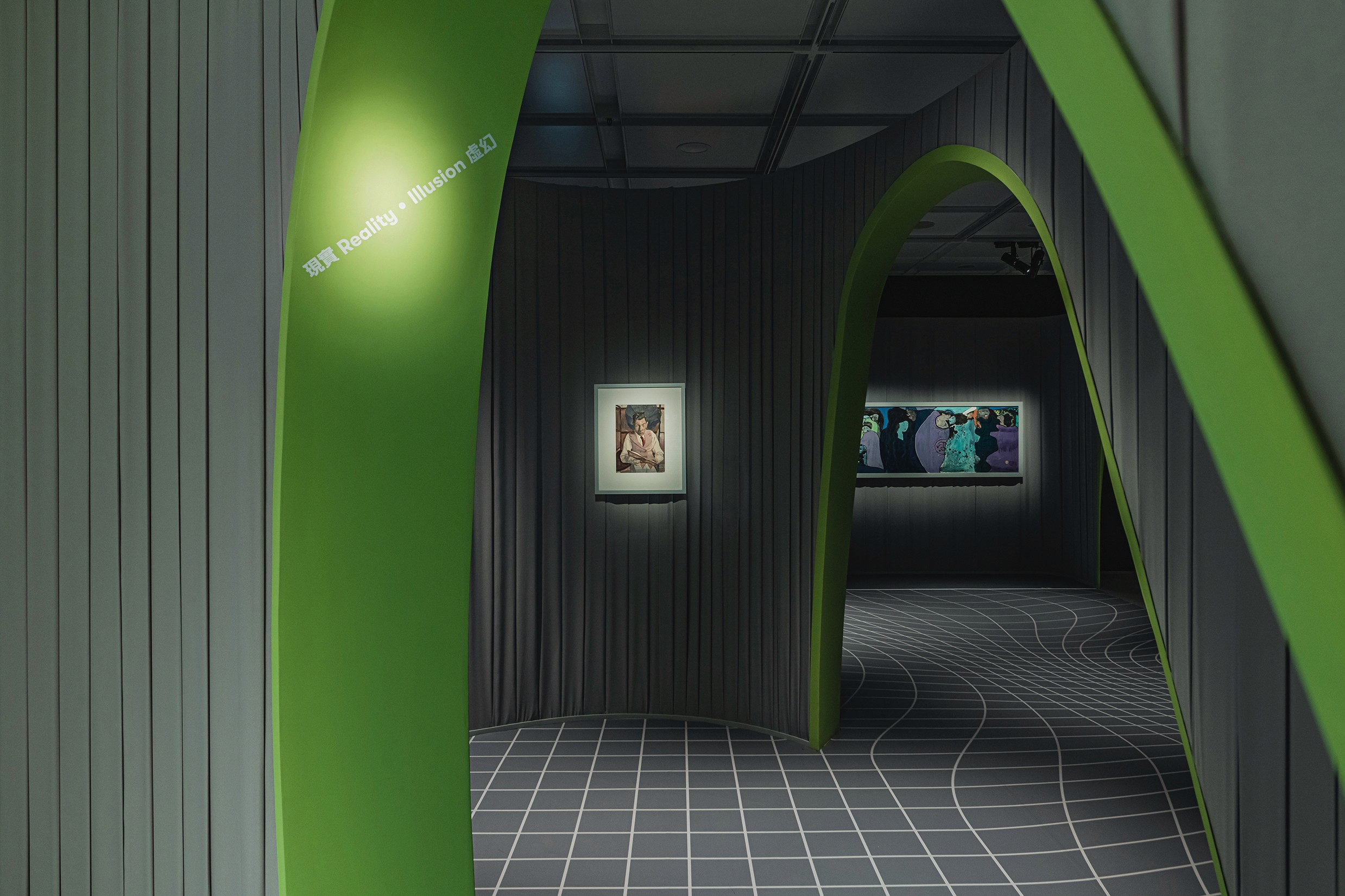
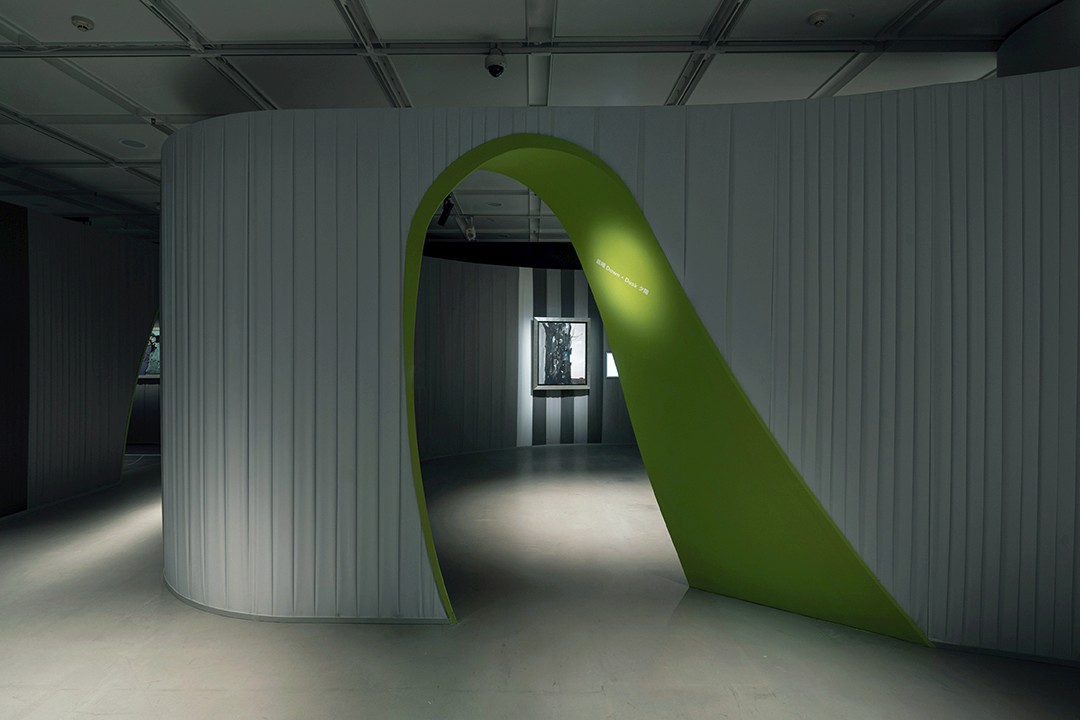
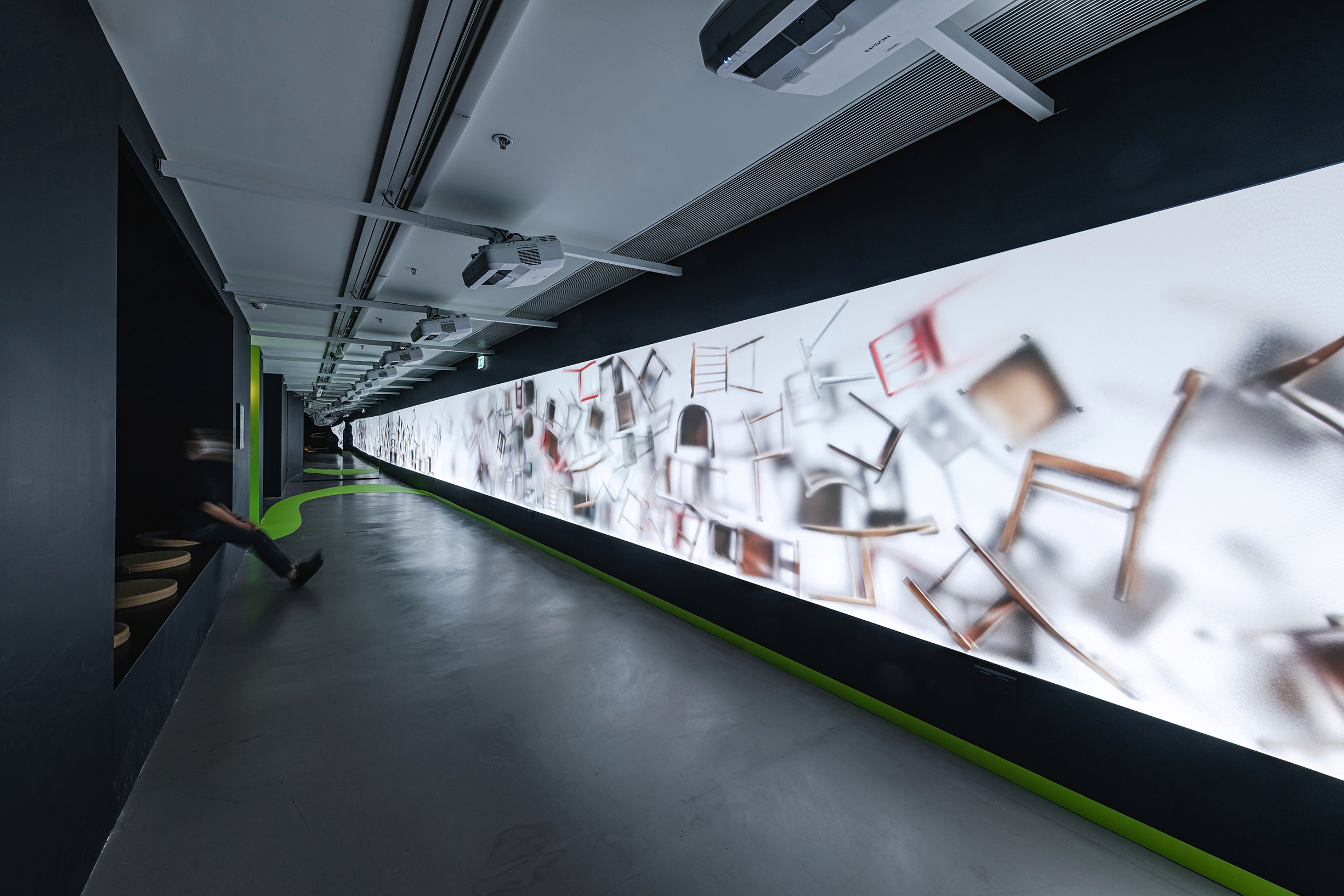
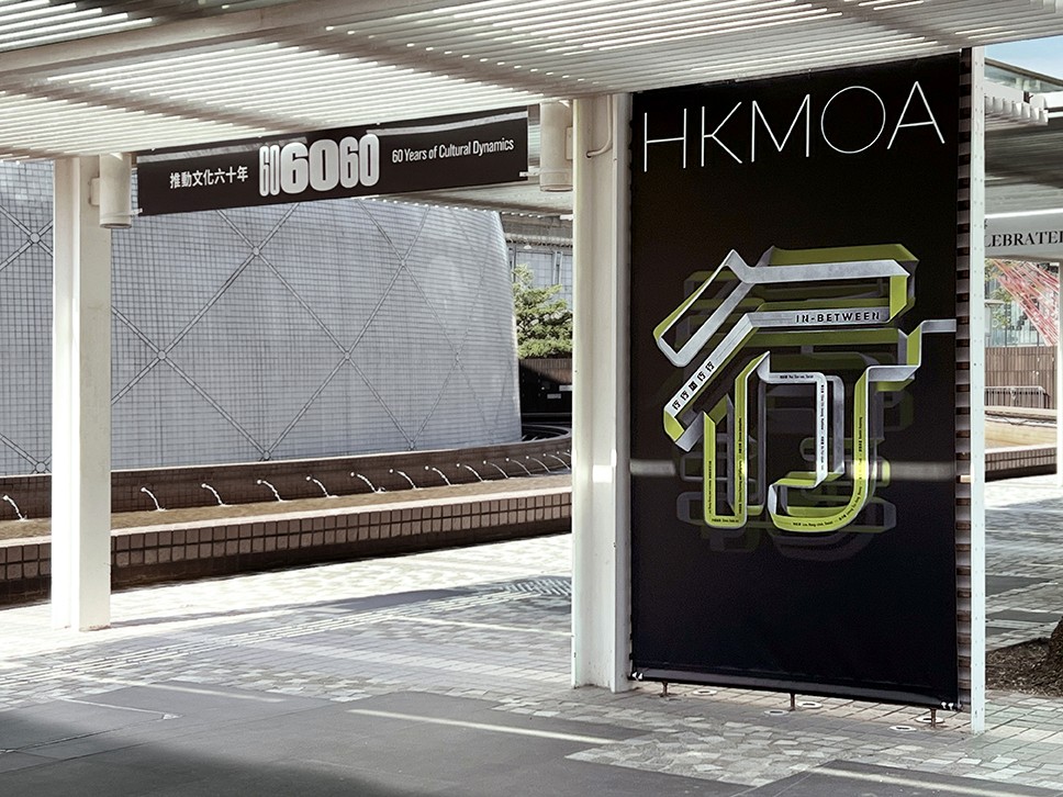
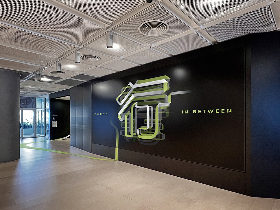
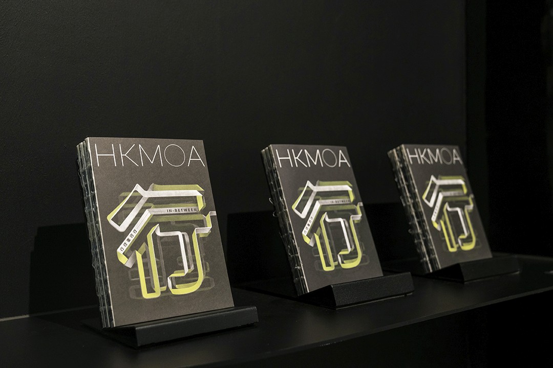
The visual identity for In-Between centers around the concept of a road, symbolizing the transformative journeys of artists. A sharp green 'road' element physically runs through the entire exhibition, guiding visitors as they explore the artwork.

The Chinese character "行" (meaning "to walk" or "to journey") serves as the key visual, with its typography designed using the same 'road' element. This connects the graphic identity seamlessly with the physical path within the exhibition space, creating a unified narrative that reflects the artists' evolving journeys.

Other projects

Let's Connect

Let’s talk about projects, collaborations, or anything design!

Copyright 2024 by Jolie Wong

Let's Connect

Let’s talk about projects, collaborations, or anything design!

Copyright 2024 by Jolie Wong

Let's Connect

Let’s talk about projects, collaborations, or anything design!

Copyright 2024 by Jolie Wong